- hafsa
- October 14, 2025
- 3:01 pm
- No Comments
Ultimate Guide to Design a Homepage
That Bring Clients for Service Businesses
How to design a homepage
that bring clients
for service businesses
- Home
- Blog
Table of Contents
No matter how good your services are, if your homepage isn’t designed to guide visitors, build trust, and make them curious to learn more, you’re probably losing potential clients every single day without even realizing it.
That’s exactly what this guide is about, I’ll walk you through how to design a homepage that converts one that not only looks clean and professional but also connects with people, communicates your value, and helps you turn visitors into paying clients.
Whether you’re a coach, consultant, designer, or agency owner, these homepage design best practices will show you how to make your website work for you, by attracting the right audience and inspiring them to take action.
2. What Makes a Homepage High-Converting?
A high-converting homepage isn’t just about visuals or fancy animations.
It’s about clarity, trust, and persuasion.
Think of your homepage as a guided journey, from curiosity to confidence.
Service businesses depend heavily on trust.
People don’t buy coaching calls, design packages, or SEO services…
they buy confidence.
That’s why the first thing your homepage should do is make them feel:
“Yes, this person gets me.”
A homepage that converts focuses on emotion before explanation.
That means your hero section should be crystal clear, your copy conversational, and your visuals relatable, not stocky or cold.
3. The Anatomy of a High-Converting Homepage (Step-by-Step Framework)
If you want to build a homepage design that bring clients, you need more than pretty visuals.
You need a clear structure, one that guides visitors from “Who are you?” to “Where do I book a call?” without confusion or hesitation.
Let’s break it down step-by-step.
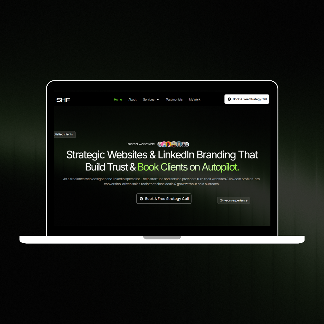
1. Hero Section: Hook, Headline, and CTA That Grabs Attention
Think of the hero as your elevator pitch. In 3–7 seconds someone should know:
Who you help (exact audience)
What problem you solve (clear outcome)
What to do next (one simple CTA)
Simple formula for a headline:
[Who you help] + [What you do] + [Big benefit/result]
Example headlines:
“Helping coaches turn website visitors into paying clients.”
“Websites for consultants that book more strategy calls.”
Hero microcopy tips:
Use one bold sentence for the headline.
One short supporting line that explains the offer in plain words.
One visible CTA (Button): e.g., “Book a Free Call” or “Get a Free Homepage Audit.”
Use a friendly photo or a short background video that shows real people (not generic stock).
Why this matters: The hero is your first chance to show you understand the visitor. If it’s fuzzy, they leave.
2. Add Social Proof Immediately After the Hero
This is where most service businesses go wrong, they wait too long to show credibility.
But when someone lands on your homepage, they’re asking:
“Can I really trust this person?”
That’s why I always recommend placing testimonials, client logos, or success stats right below the hero section.
It builds instant trust especially for service businesses where credibility is everything.
What to show here (use one or two of these):
Client logos (small row of logos)
One-liner testimonials (1–2 short quotes)
Quick result numbers (e.g., “50+ clients helped” or “Avg. 30% increase in calls”)
This simple tweak alone can dramatically improve homepage conversions because it bridges the gap between interest and trust.
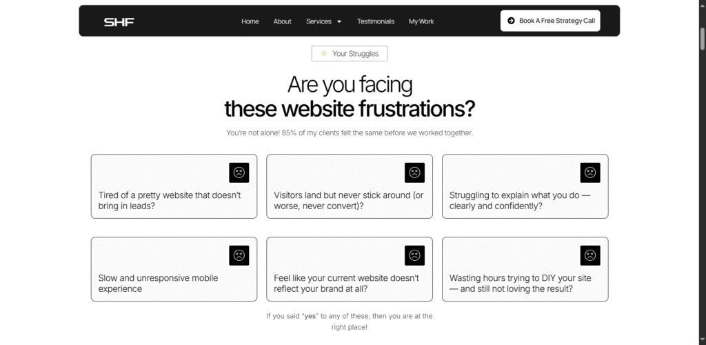
3. Problem–Solution Section: Speak to Their Pain Points
Once you’ve built trust, it’s time to show empathy.
Talk about the problem your audience is facing and how you solve it.
Keep the tone conversational and benefit-driven.
Structure:
1–2 lines: Describe the problem the visitor likely has (use their words).
1–2 lines: State your simple solution (how you fix it).
1 short example or micro-story.
Example copy:
- Problem: Many service owners have attractive websites that don’t get calls.
- Solution: I design homepages that guide the right visitor to book a call — clear headlines, proof early, and friendly CTAs.
- Quick story: When I changed a coach’s hero + added testimonials under it, their booking rate doubled in 30 days.
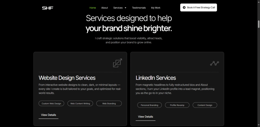
4. Services (Simple cards — 3 to 4 only)
This section isn’t about listing everything you do.
It’s about guiding visitors to what matters most.
Show your core services in bite-sized cards. Each card should include:
Service name (short)
One-line benefit (what the client gets)
Small CTA (Learn more / View package)
Example layout (3 cards):
Website Design — A homepage that turns visits into calls. Learn more
SEO for Service Sites — Get steady organic leads without the guesswork. Learn more
Brand & Messaging — Words and visuals that attract the right clients. Learn more
Why 3–4 only? Too many choices = decision paralysis. Keep it focused.
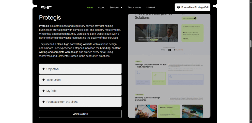
5. Your Portfolio (Show, don’t just tell)
Visitors want proof. A portfolio shows how you solve problems.
Portfolio card for each project should include:
Project thumbnail (screenshot)
One-sentence problem: “Low leads despite good traffic.”
One-sentence solution: “Redesigned hero, added testimonial strip, improved CTA.”
Result in plain numbers: “+43% booking rate in 6 weeks”
Link: View case study
Example portfolio item:
Project:
Bright Coaching
Problem: Visitors not booking.
Solution: Reworked headline + social proof under hero. Result: Bookings up 40% in 30 days. [View case study]
Pro Tip:
If you don’t have many case studies yet, use one detailed case study and two mini-projects showing results.
6. Authority builders
Authority sells especially in competitive service industries.
Include a section with metrics like:
- “100+ projects completed”
- “Ranked among Top 11 out of 9,000 participants on LinkedIn Growth Challenge”
- “Featured on HubSpot Blog”
These are credibility anchors. They tell visitors: “I’ve done this before. You’re in good hands.”
7. CTA Section: Guide Them to the Next Step
Don’t make visitors guess what to do next.
Every high-converting homepage has a clear, action-oriented CTA.
Whether it’s:
- “Book a Free Strategy Call”
- “Get a Custom Website Audit”
- “Let’s Build Your Homepage That Converts”
Make sure your CTA button stands out visually and repeats at least twice once near the top and once near the end.
The goal: make taking the next step feel natural, not forced.
Button rules:
Make it one color that stands out.
Use action verbs (Book, Get, See).
Don’t use “Submit” or “Learn more” as the main CTA.
Pro Tip:
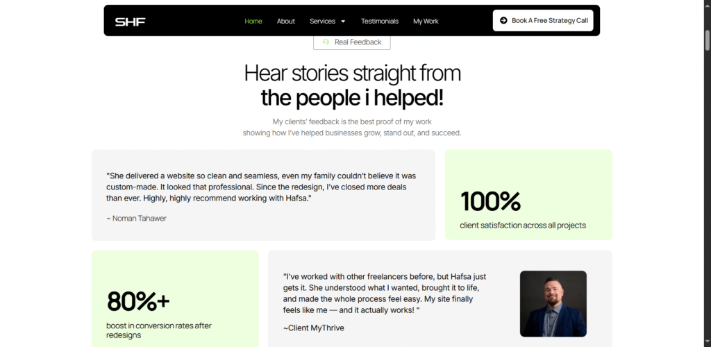
Always add 2-3 testimonials with CTA. It makes easier for the visitor to trust you and your services. For reference, look at the image below.
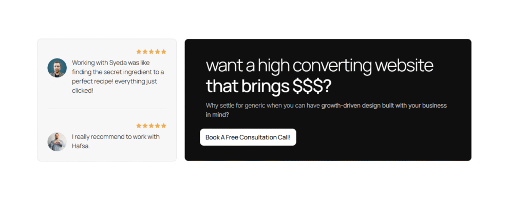
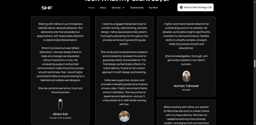
8. Testimonials (Longer quotes + micro-stats)
Testimonials are more powerful when they’re specific and short.
How to display them:
1–2 spotlight testimonials (50–80 words) with client photo and job title
3–4 micro-testimonials (one-liners) or result bullets
Optional: star rating or short video testimonial
Example spotlight testimonial (plain):
“I hired Hafsa to redesign my homepage. After the changes, consult bookings increased 45% in one month. The process was simple and calming.”
— Sara Ali, Career Coach
How to ask for a testimonial (quick template):
“Hi [Name], thank you again for working together. Would you mind sharing a 1–2 sentence line about the result you saw and how it felt? If you prefer, I can write a short draft for you to approve.”
Why this works: Specifics (numbers/outcomes) convert better than praise like “She’s great.”
8. Footer (Simple & useful)
Footer is the calm closing spot. Include:
Contact info (email or phone)
Quick links: Services | Portfolio | Blog | Contact
Social icons
A small final CTA: “Let’s work together — Book a quick call”
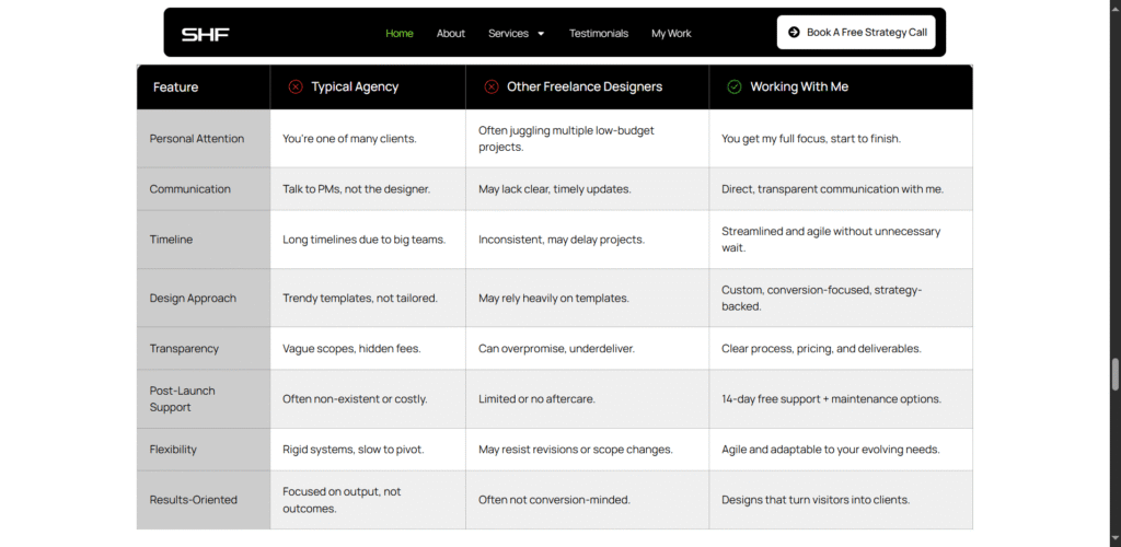
Bonus Section You can add
Your Unique Value Proposition (UVP): Why Choose You?
Your UVP is what sets you apart from every other designer, coach, or marketer.
Don’t make it a generic list of features.
Make it emotional and outcome-driven.
Highlight your differentiators:
- Do you offer strategic consultations?
- Is your design process data-backed?
- Do you guarantee measurable results?
Pro Tip:
What worked best for me and my clients is to demonstrate it in a comparison table format. Something like the image below.
Your homepage isn’t just a design, it’s your first sales conversation.
Every word, color, and call-to-action is either pulling people closer or pushing them away.
And the truth is, a well-thought-out homepage doesn’t just look good, it works hard for you 24/7.
It builds trust when you’re not online.
It speaks for your expertise when clients are still deciding.
And it turns curiosity into conversion — one scroll at a time.
So, as you start optimizing your homepage, remember this:
Don’t focus on impressin…focus on connecting.
If you’re still unsure where to begin or want expert guidance, I’d love to help you build a homepage that not only looks stunning but sells with confidence.
Ready to transform your homepage?
Book a Free Consultation or Explore My Services and let’s create a homepage that turns visitors into clients.
- FAQs
You’ve got questions
Here Are the Answers
What makes a homepage design “high-converting”?
A homepage design that converts focuses on clarity, trust, and user intent. It immediately explains who you are, what you offer, and what action visitors should take next without confusion.
Key elements include a strong headline, clear CTA, visible testimonials, and a benefit-driven layout.
Where should I place testimonials or social proof on my homepage?
For service businesses, social proof builds instant credibility so it should come right after your hero section.
When visitors see real client results or reviews early, they’re more likely to trust your offer and take the next step.
How do I improve my homepage conversions?
To improve homepage conversions, start by:
- Clarifying your main message in the hero section
- Adding one strong, visible CTA above the fold
- Simplifying your layout
- Showcasing social proof early
- Using emotion-driven copy
You can also track your performance with tools like Google Analytics 4 and Hotjar to see where users drop off and optimize from there.
What are the best homepage design practices for service businesses?
Here are the homepage design best practices that consistently work for service businesses:
- Keep your hero section clear and visually appealing
- Use consistent branding and strong contrast for CTAs
- Display testimonials and trust logos early
- Make your services easy to scan
Ensure your site is mobile-friendly and fast-loading
How long should my homepage be?
There’s no one-size-fits-all answer but for most service businesses, a medium-length homepage works best.
Include all key conversion elements (hero, social proof, services, about, CTA), but avoid overwhelming users with too much text or design clutter.
If users can clearly understand what you do and how to contact you within seconds, you’ve nailed it.
What are common homepage design mistakes to avoid?
Some of the biggest homepage mistakes that kill conversions include:
- Vague headlines
- Hidden or weak CTAs
- Too much text or animation
- Missing testimonials
- Talking more about yourself than your clients
- Poor mobile experience
Fixing these instantly improves trust and engagement.
How often should I update my homepage?
Ideally, review and refresh your homepage every 3–6 months.
Update your testimonials, CTAs, or services as your business evolves and run A/B tests to keep improving conversions.
What tools can I use to analyze my homepage performance?
You can use:
- Google Analytics 4 (GA4) – to track conversions, bounce rate, and user flow
- Hotjar or Microsoft Clarity – for heatmaps and session recordings
- Google PageSpeed Insights – to measure load speed and mobile performance
These insights show exactly where your homepage is performing well and where it needs improvement.
Want A high Converting Website?
If your site isn’t bringing in leads, it’s not working hard enough.
Let’s fix that.
👉 Book a free consultation today and discover how I can help you generate 3x more leads — just like I’ve done for businesses worldwide.
where strategy meets standout design.
Contact
- hello@hafsafatima.com
- +92 314-11307-46
Ready to turn your website into a lead-generating machine?
If your site isn’t bringing in leads, feels outdated, or just isn’t doing its job—it’s time for a change.
Book a free call to see how we can fix that.